Alright. This is a dooooooooziiie of a design post, including ‘before’ shots, the process, an EPIC FAIL, the remedy, the ‘after’ photos, resources, ‘get the looks’ and a VIDEO. Tell your boss that you ate bad salmon and that you and that you need to go to the hospital for an emergency surgery, possibly even a C section or kidney removal. Something that could take hours. Then go home, grab a cup of coffee, diet coke or wine (I like to give you options) and settle in to read the epic guest room make-over post.
Here goes: The guest room is FINISHED thanks to a partnership with DutchBoy paint. Dunzo. Like President Obama and Michelle could randomly show up at my door for the weekend and all we’d have to do is add some flowers. I mean, for them of course we’d have to get REALLY beautiful flowers, probably open garden roses flown in from Holland, watered by the tears of angels, but other than that, this room is good to go. Finally.
But before I show you the ‘after’ you must suffer through the process. Because I had to (and because the process is what this blog is all about).
We moved into this house 9 months ago and started fixing up this bad boy. BEFORE we moved in the room looked like this and I blogged about its needs HERE:

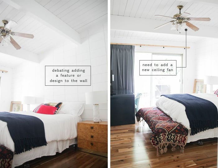
To recap: disgusting pee carpet, gross painted ceiling, lovely ‘vintage’ ceiling fan, etc. Oh and you can’t tell but there is an insane texture on the walls – as if it was a gothic cathedral in Prague in the 1700’s. Like serious texture.


So we skim-coated, painted the walls, put down new beautiful hard-wood flooring and it started looking way better.

TA DA!!!!! Isn’t it beautiful, you guys? It only took 9 months, 2 design assistants and 3K to do that.
Kidding. This is what it looked like after we moved in and unpacked and it clearly wasn’t designed or even thought about. It was good enough for the parents to come and sleep in for the holidays but needed some serious considering.


We lived with it like that for about 6 months while we worked on the rest of the house.
I’ve gone back and forth about whether I like that brick wall thing ever since we bought it. But dry-walling it sounded annoying and expensive, so I wanted to try to work with it and it seemed like a good opportunity to use the grid of bricks in an interesting way. So one night, 3 nights before the Domino shoot I decided to grab some beer, put on Season 3 of the OC, grab 18 different colors of paint and see what the beer tells me to do, because that’s how real designers design.
In my defense I will say that this idea was endorsed by Ginny, Brady and Scott and we all picked out the colors together. It was kinda thought out, but we all had our doubts.

What I did to that wall was a G.D. masterpiece. I’ve since decided to quit styling and dedicate myself to my true passion – tipsy public performance painting. How do I create such beauty, you ask? Well, how did Mozart compose such melody, or how does Sara Silverman think of a joke?
You can’t explain it, the genius is the true miracle.
Also I did have some inspiration pics/references to work off of, these weird 80’s color blocked buildings, but sadly the wall never really came to resemble them at all.

I started with just a few colors and kept them looking more ‘water-color-y’ without hard edges (especially since there aren’t any hard edges – the bricks were rough). Then I was all, MORE, I NEED MORE NOW AND COLOR MORE COLOR FAST HURRY I’M SOBERING UP!!!

But then that looked like a drunk monkey took over painting the wall with those crazy pops of color. So I decided to have it be more tonal and just do these kinda weird pastels together (the last photo). And then it looked like Easter threw up on my wall. It was terrible and incredible all at once. I hated it in an aggressive sort of way where it actually made me angry. It’s probably because the rest of the house is open and white/bright so all of a sudden when you caught this through the doorway your eyes were bombarded with these annoying colors, challenging your controlled temper, making you want to do violent things to helpless animals. It was that bad.
Click through to see the afters …
So we quickly painted it back to white – which took approximately 2 hours and I was so relieved. Seeing it white again made me feel like I had gotten a four-hour massage – all of a sudden I was relaxed, calm and happy. (By the way remember when i did this HIDEOUS paint treatment to my old guest room? Geezzz, I mean, I clearly like to take risks in guest rooms, right?).
Anyway. So it was back to this (below). Better than the before, but still not really designed.

We did split those Decorview curtains into two panels. I know that in rooms with sliding glass doors its more typical (and arguably more functional) to have them all on one side, but visually that made me very upset. The imbalance wasn’t something that I could handle and was sure to drive me to the stylist loony-bin. So they happily changed it for me.

At this point I had given up on the wall treatment and I just wanted this room to look pretty, happy, functional and be a space that is really warm and inviting. The pics are kinda out-of-order (these were taken before I did the crazy easter explosion but after we had fixed up everything) but they were the only ones that showed where we were before the final makeover.


So we got a great pretty modern upholstered bed, replaced the fan and then started from ground zero. Meanwhile Dutch Boy reached out and was like, ‘Hey, wanna try our paint?’ and I said, ‘Sure, send over that fandeck’. So we got the fandeck and there were a lot of really bright, fun saturated colors.
Those of you who follow the blog regularly you know that like furniture, lighting and accessories, I use a lot of different resources. And when it comes to paint I’m kinda all over the place, and yet I get really stuck on some colors that I need to branch out from. Choosing paint colors can be really difficult so I find that I cling to the ones that I love a little too strongly and it was time to find some new ones.

So we all laid on the bed, with that baby, and picked out a bunch of pretty colors.
I was organizing my portfolio recently and I noticed that sooo many rooms or houses that I’ve done have been white or gray. Sure, this is probably because I love these two colors and they look good with almost everything, right? But as some one who loves color I figured It was time to actually paint a COLOR and see what happens, and the guest room is the perfect opportunity for it. I wanted something that was happy, but not annoying – more like Zooey Deschanel less like Fran Drescher. I also wanted the transition from bright white living room/open hallway into the guest room to be seamless and natural, not jarring like the crazy multi-color wall I did above. So I wasn’t going to all of a sudden stray into a weird color palette – it still needed to feel calm and happy.
We ordered a bunch of samples in my usual/predictable color palette as well as some less predictable colors (chartreuse, bubble-gum pink). We ended up using the chartreuse and the pink in my office (which I love A LOT) and then swatched a few colors here:

The darker blue was just a bit dark for in there, the pink was too ‘baby’, but the lighter blue/gray (DutchBoy Old Faithful) felt happy and cheerful and, was an actual color (not just a gray with blue in it, it was a blue with some gray in it). Pastels are in, as we all know, so why not embrace that a little bit, right?
Then, like when most people paint their guest rooms, a 9 person video crew showed up to film me do it. Oh and we decided to paint the inside of the closet a bright color because there is no reason that your guest room closet shouldn’t be a fun color (I chose Dutch Boy Baltic Sea and I LOVE it and secretly want the whole room to be that color now).

We cleared everything out of the room to paint and shoot and pretty much destroyed my house, as we do practically every day.

So with the help of my friend Mike (and Brady) we painted that room in a few hours. A little shout out to DutchBoy paint – it covers GREAT, I’d say better than some of the other companies but I don’t like naming names. And it comes in these plastic tubs that are strangely easy to carry (because they are square and have flat plastic handles you can carry 4 EASILY at a time without the usual metal handle severing off your fingers). And they are super easy to pour because they have spouts so they don’t make a mess, which I definitely need help with. Plus their caps screw on instead of the usual metal top so storing and reusing is just easier and cleaner. You can see it in the photo below.

So paint the walls we did:

Don’t mind the state of my hall closet. Nothing to see there. Move right along.
Ready to see the finished room with the real re-design?

Boom!!!!!!! There is my happy new guest room. And I really love it. Every single time I walk into the bedroom I get happy because of that color. Its blue, y’all, it isn’t even pretending to be gray or a neutral. It is blue and calming, but has a really good energy to it.

I love everything thing in this room – the map of Oregon from Schoolhouse Electric, those awesome Wall Sconces, that simple, lowWayfair" target="_blank" rel="noopener"> Upholstered Bed from Wayfair" target="_blank" rel="noopener ”nofollow”">Wayfair and that pretty white rug from Loloi that makes everything feel so much bigger – and yes, the guest room with very little foot traffic is pretty much the only place that I can risk a white rug, but it’s just so pretty.

That pretty floral pattern was a vintage scrap of old decorator fabric from ebay that I’ve been hoarding for like 3 years, waiting for its big debut. So we sewed them into large shams and they found a home. It’s strange how well it works with that painting ….. soo good.

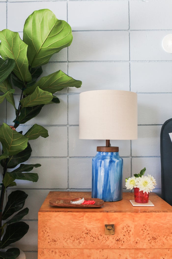
Yeah, we double lamped and I’m not ashamed of it. The glass lamps (that we painted the inside of, DIY coming shortly) are good for just good ambient/mood and overall lighting and the sconces are perfect for reading. They are plug-in sconces so you can kinda put them anywhere and now I really want them in my bedroom. As much as I love directional light like this because it looks so cool, it doesn’t provide good overall nighttime lighting so I like to mix the good lighting. What did I do with the pretty West Elm marble lamps? Well, I found a home for them in my master bedroom flanking my TV, don’t worry.
The night stands are vintage (Milo Baughman from the flea market) and the chair is Milo Baughman from Palm Springs … What? I like me some Milo.

Simple styling of a tray for jewelry and flowers. Things I had lying around that look cute/inviting for guests.

That tiny polka dot bedding is from Target and I have it in my master bedroom as well. It keeps getting softer and softer, by the way.

This is the first time that I’ve had a full bed – headboard and sides – in my life and man it helps a room feel pulled together and grown up. And I love the strong pop of blue in the closet. Its going to stay that neat and organized for approximately 9 hours before I stuff 1 million bags of Charlie clothes, Brian’s wig collection and random sports equipment. It’s for costumes/plays and Halloween, folks – don’t get too excited.

But for now its real neat and cute, right? Simple shoe organizers here.

I couldn’t bear to attempt a gallery wall in here – I wanted this room to feel calmer than that, and I would have had to go floor to ceiling to really engage the whole space (or do art ledges which I thought about), but instead I decided to hang this huge Oregon Wall Map from Schoolhouse Electric that I love (I’m from Oregon, Brian and I met at U of O *GO DUCKS* and I just love the scale of it). The poster itself is pretty inexpensive, like $52 but the framing of course was $300 – which is actually a STEAL and I think normally would cost $500 but Tim at Curve Line Space is super nice to me. Its not archival or anything, but it looks real good. .

Welcome to Brian’s little home office. As much as I loved that 80’s waterfall desk it was just too big for the space (and will be on sale on Chairish next week as well as three more of those navy blue chairs). This little desk has a WAY better scale, still works with our little filing cabinet and once we sprayed the handle gold (from silver) it was pretty perfect. Most simple parsons desks don’t have drawers so I like that it has that function. The cabinet is ikea.
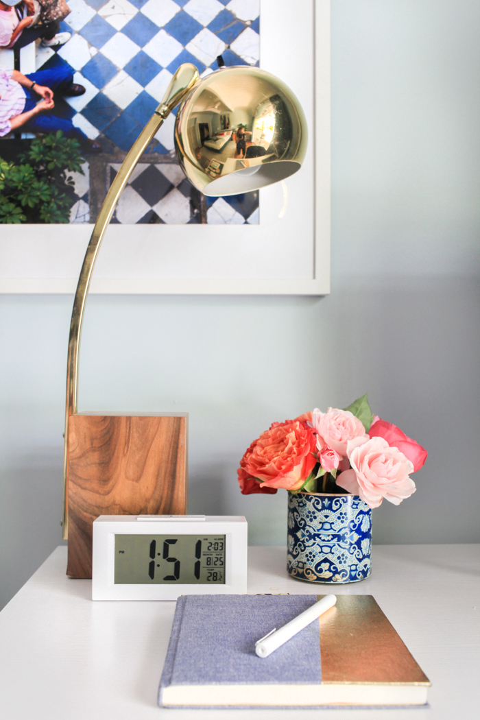
The artwork is this graphic/colorful photo from Artfully Walls (that had all of our colors in it), and some drawings by my grandma that are weird and hilarious that I had framed.

Where is that incredible lamp from, you ask? Sorry, folks. Its vintage from Portland but when I have my line of products there will be something very inspired by that boy. It’s so good (and I think it was like $60).

Naturally Brian only uses gold desk accessories. This tray and those pretty things were propped for the shoot to look all stylish but it hasn’t moved yet so I’m thinking he quite likes the gold. Men can use gold staplers, too, you know (besides that one is designed by Nate Berkus).

Stay tuned for a step by step guide on how we made this hand painted glass lamp using these lamps next week. Super easy DIY, folks.

It’s always nice to have a bench at the foot of the bed but in this case it became kinda an obstacle with the desk because you had to go left and then go right, but once we put it against the wall it felt a lot bigger and the flow was better, and there is still somewhere to pile luggage, etc.
Oh and the fan – yes, it was updated, obviously, with Wayfair" target="_blank" rel="noopener">this simple modern one. We got it fromWayfair" target="_blank" rel="noopener"> Wayfair and it’s just simple and white, with light and remotes.

I think that is it, folks. I love walking into this room and have spent SOOO much more time in there since. The only thing that I want to do is add pretty hardware to the closet doors. But otherwise I’m going to try REALLY REALLY hard not to move anything, not to borrow any pillows, or accessories for other shoots or clients. I want to make sure that the ‘after’ sticks and that next time anyone drops by for a slumber, that there is a pretty, pulled together, happy, inviting guest room for them. Just add flowers.
Now you must watch the video to see the room in action and check out some of my other tips over at Dutchboy.
Get the Look:

1. Dutchboy Old Faithful | 2. Dutchboy Baltic Sea | 3. Wayfair" target="_blank" rel="noopener">Upholstered Bed | 4. Knit Tassel Throw | 5. White Desk | 6. Grey Bench | 7. Inlay Frame | 8. Dot Sheet Set | 9. Glass Lamp | 10. Blue Herringbone Throw | 11. Fiddle Leaf Fig Tree | 12. Gold Stapler | 13. Oregon Wall Map | 14. Swing Arm Wall Sconce | 15. Pink Velvet Pillow | 16. White Jar Vase | 17. Checkered Floor Photograph | 18. Marble Cleat Box | 19. Striped Woven Pillow |20. Loloi Byron Rug
Final room photographs by the always lovely: Tessa Neustadt
This post was in partnership with DutchBoy paints but all design choices, words, etc are mine. Thank you so much for supporting the partners that make this blog stay in bidness.
Don’t forget to check out: The Kitchen, Master Bedroom, Living Room, Nursery, Studio and Deck, and general before photos and house design inspiration.


Where did you get the art above the bedroom?? Thanks!
Hello! What color describes the curtains? Dark grey? Charcoal? Thank you!
Beautiful room, eclectic bright, sophisticated and sunny all in one! (and great font in comments ?)
The art above the bed? Please tell us about it.